CAMERA USE WEEK 5 :
COLOUR AND FOCAL LENGTH
In the most basic terms, the focal length of a lens is the distance from the mid-point of the lens to the point at which light rays parallel to the centre-line of the lens are focused, as in the diagram below.

IN CLASS EXERCISES...1
Using a wide focal length take a close up of a head and shoulders portrait.
Using the same lens take a low angle portrait.
 |
| 18mm f/11 1/500 ISO 800 In this shot I have kneeled down to take the low angle shot . Raemons body fills the frame at the bottom leaving alot of negative space around her head and looks really tall. I have an over exposed top part of the image because my ISO was to high. Change to your highest focal length lens and take the same shots. |
 |
| 55mm f/11 1/500 ISO 800 A head and shoulder shot with the lens 55mm . The background is closer to Raemon and looks much larger than the 18mm shot, but her portrait is in focus the background slightly blurred. And again ISO to high. Shutter speed is to high should be 60 - 80 as we are doing portraits. Im finding all the way through my blog I am saying the same thing over and over when am I going to focus and check SETTINGS ! Use the 70-300 telephoto lens and take another close up portrait.  75 mm f/11 1/500 ISO 800 ISO and shutter speed to high as explained previously. Narrow DOF Now take a portrait with your subjects eyes closed and one with their eyes open .  80mm f/11 1/500 ISO 800 |

80 mm f/11 1/500 ISO 800
Take a portrait using three different focal lengths.
Move each time to make sure the subject is the same size in each frame.
 |
| 18mm f/11 1/500 ISO 800 |
 |
| 35mm f/11 1/500 ISO 800 |
 |
| 55mm f/11 1/320 ISO 800 Apart from the settings not right I have the images for this exercise. |
Reshoot the same photo using the same focal lengths this time do not move your camera.
 |
| 18mm f/11 1/400 ISO 800 |
 |
| 35mm f/11 1/400 ISO 800 |
 |
| 55mm f/11 1/400 ISO 800 |
TAKE SOME PHOTOGRAPHS INCLUDING A STILL LIFE AND A PORTRAIT INCORPORATING CONTRASTING COLOURS.
( COOL AND WARM )
(cool and warm )
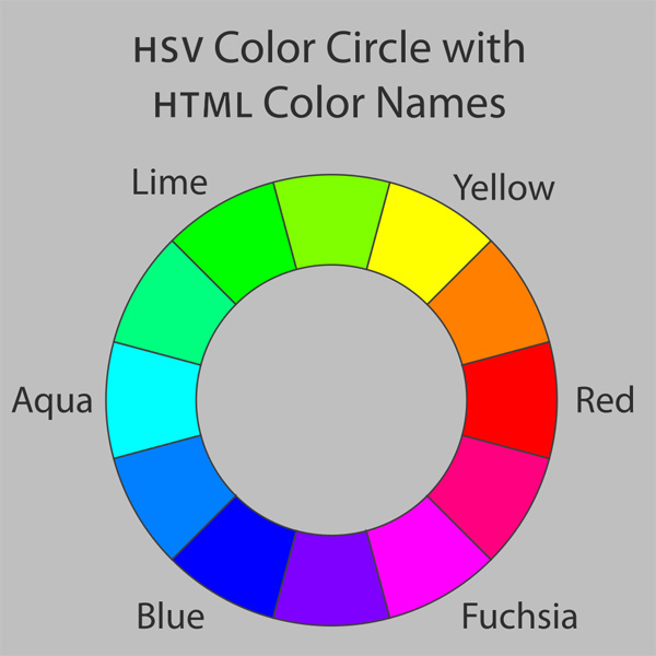
Contrasting colors are those on opposite sides of the color wheel. The further apart and more directly opposite each other, the greater the contrast.
Two colors from different segments of the color wheel are contrasting colors. For example, red is from the warm half of the color wheel and blue is from the cool half. They are contrasting colors. Yellow and purple are contrasting colours orange and green , orange and purple.
 |
| f/11 1/125 ISO 800 For starters I have a much to high ISO should be 100 outside in the natural lighting. But I have contrasting colours in the background. Blue and orange (cool colour and a warm colour ). Raemon is dressed in blue contrasting with the orange as well. |
 |
| f/11 1/1250 ISO 800 I have got some focus issues the settings are ridiculous have I not learnt to check the settings . Contrasting colours the red and the blue . Blue background then we have the orange then the red wording. I noticed this all around Otara this type of contrasting colours for their signage. Warm and cool colours. |
 |
| f/11 1/1,600 ISO 800 Ridiculous settings anyway the red and yellow are contrasting colours and settled down with the black and white. A striking sign it stood out and wasn't hard to read.and the orange and green |
 |
| f/11 1/125 ISO 800 This image caught my eye at the town centres hair dressers because of the CONTRASTING colours, red lipstick and blue eye shadow . Warm and cool colours. |
 |
| f/11 1/400 ISO 800 Shutter speed to high as the ISO . Contrasting colours yellows and purples , orange and blues , orange and greens. Nice painting. |

 |
| f/11 1/800 ISO 800 I don't want to talk about my settings for awhile . The picture we have warm and cool tones. Theres a peachy colour in there and it contrast well with the blues and greens. The pink throws me off abit. |
 |
| f/11 1/100 ISO 800 We have got an array of colours going on here very colourful hot and cold, complementary and contrasting. |
 |
| I love this image, look at the contrasting colours here the blue and the orange. |
Take some photos including a still life and a portrait incorporating complementary colours ( use colour guide )

A traditional color star developed in 1867 by Charles Blanc. The traditional complementary colors used by 19th-century artists such as Van Gogh, Monet and Renoir are directly opposite each other.
Complementary / opposite color pairs, are red & green, yellow & violet, and blue & orange. In the RGB color model, which applies to colors created by light, such as on computer and television displays, the complementary/opposite pairs are red & cyan, green & magenta, and blue & yellow
 |
| A portrait of Raemon again with the background showing complementary colours, being orange and blue , and the red and green. The background is colourful but the colours complement each other. Nice example |

| f/11 1/125 ISO 800 Ok wrong ISO for starters should be 100. I have complementary colours red and the green. The red really stands outagainst the green. Red the warm colour and green the cool. The red stand s out more because you have the white behind it then the green bottle. |
 |
| f/11 1/400 ISO 800 The red and green again nice complementary colours . |
 |
| f/11 1/640 ISO 800 Omg these settings are driving me crazy anyway red and green again. The contrasting colours don't stand out as much because of the over powering complementary colours in the background. |
|
| f/11 1/800 ISO 800 We have complementary colours here , the purples with the yellows, green and reds |

f/11 1/100 ISO 800
Very colourful image here we have contrasting and complementary, over powering but pretty.
 |
| This is a pic I wanted to add just to show red/ green not taken by me |
No comments:
Post a Comment